









© 2025 ideal.shop All rights reserved.
Karrusel - billedstørrelser og beskæring
Karruseller kan være en udfordring at arbejde med, fordi de ser forskellige ud på store og små skærme. Men her får du lidt indsigt og forslag til, hvordan du kan overkomme de fleste problemer.
Karruseller UDEN fuld bredde
Denne type karrusel er nemmest at arbejde med, da billederne ikke beskæres på store og små skærme. De skifter blot størrelse.Reglen er, at billederne bliver så vist så store som overhovedet mulige, uden de ryger uden for rammen.
Stor skærm:
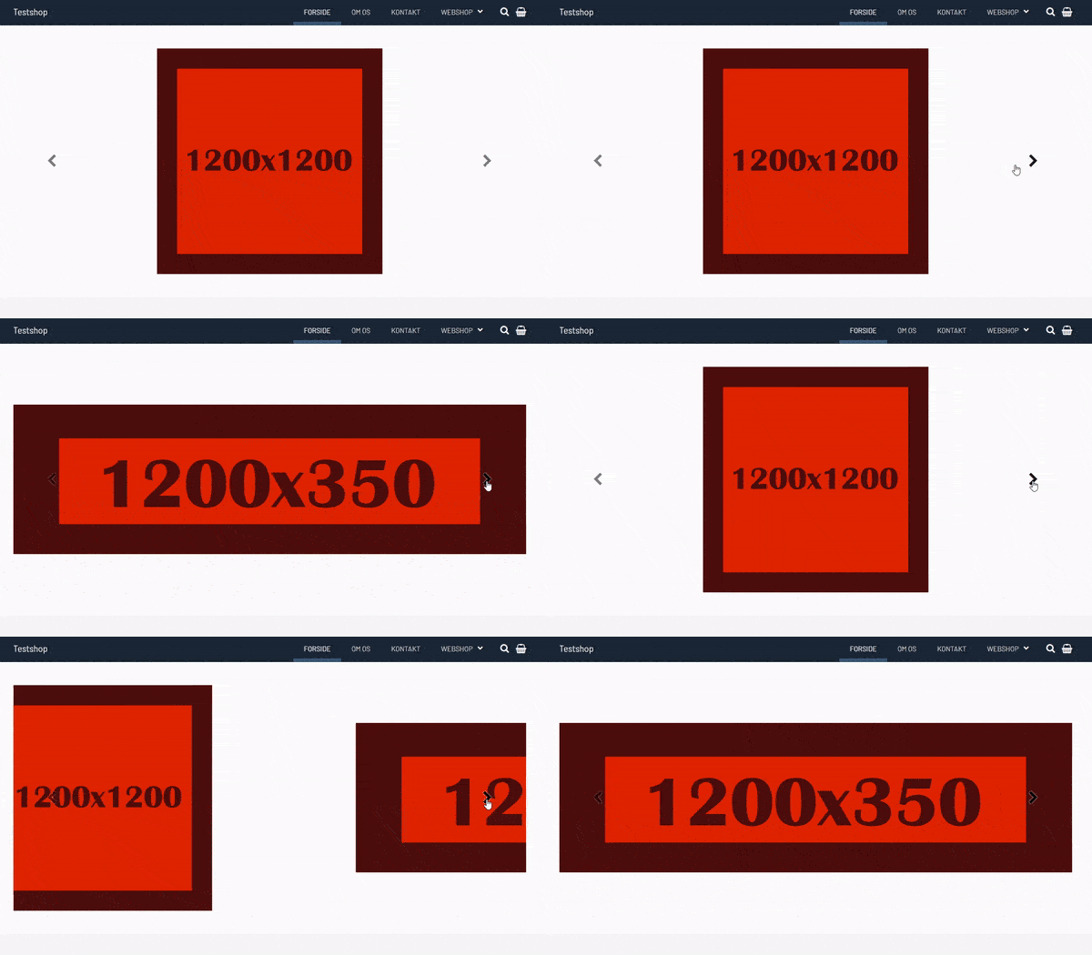
Lille skærm:
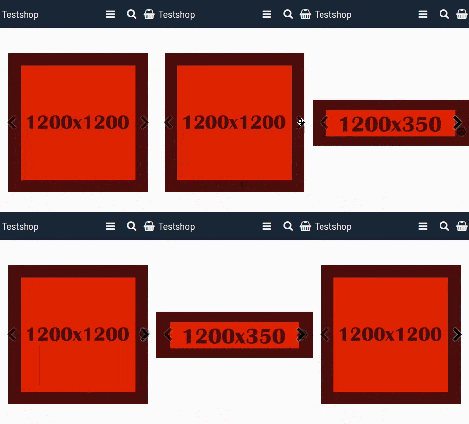
Karruseller med fuld bredde og dynamisk højde
Denne indstilling er også relativ nem at arbejde med, da billedet altid vises uden at blive beskåret. Det er blot størrelsen som ændres, når webshoppen vises på små skærme.Derfor er det vigtigt at bruge billeder, som stadig giver mening når de vises i små udgaver.
Du skal også passe på med at bruge tekst ovenpå billedet, da der måske ikke er plads til alt teksten på små skærme.
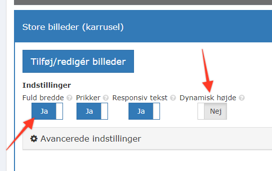
Karruseller med fuld bredde uden dynamisk højde
Denne type karrusel er stiller meget store krav til dine billeder, da de NØDVENDIGVIS vil blive beskåret. Både på store og små skærme.Reglen er, at billederne bliver så vist så store, at de dækker hele arealet inden for rammen.
Stor skærm:
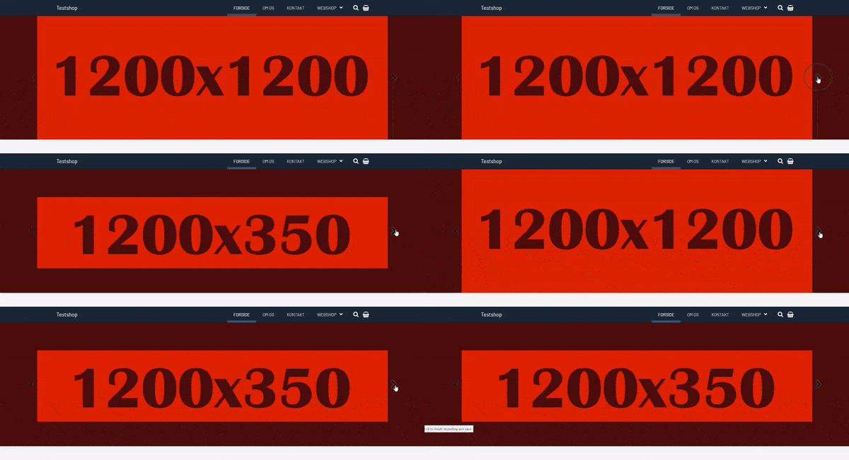
Lille skærm:
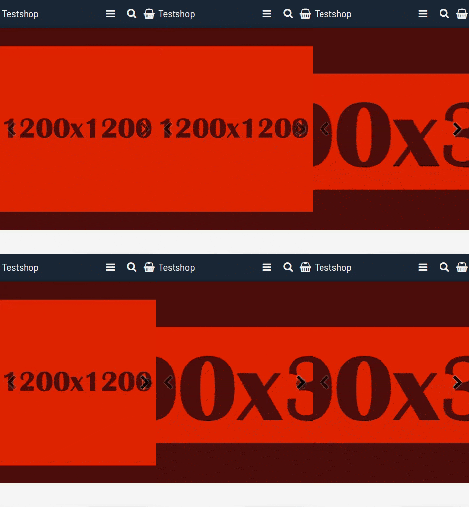
Som det fremgår herover, så er der en meget stor beskæring af billederne på enten den store eller den lille skærm, afhængig af billedets højde og bredde forhold.
For at tage højde for dette kan du overveje følgende strategier:
- Brug billeder som kan tåle at blive beskåret. Eksempelvis landskaber. Undgå detaljer på billedet (tekst, produkter eller ansigter).
- Brug billeder som har en højde på minimum 450 pixel. Sørg også helst for, at alle billeder i den samme karrusel har ca. samme størrelse.
- Brug værktøjet "Skjul side-sektioner baseret på skærmstørrelse". Med det værktøj kan du styre om en karrusel vises på store og/eller små skærme. Find værktøjet ved at søge efter det i administrationen.