


© 2025 ideal.shop All rights reserved.
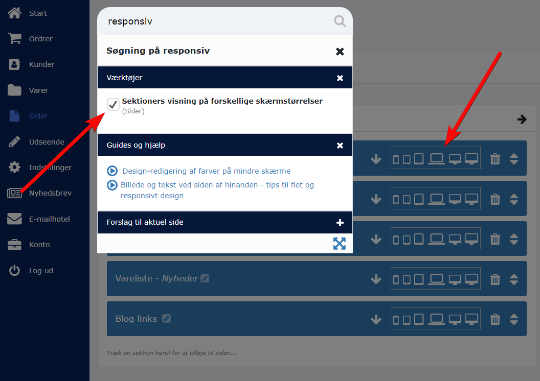
Sektioners visning på forskellige skærmstørrelser (responsivitet)
Ved at bruge værktøjet "Sektioners visning på forskellige skærmstørrelser" kan du ændre, hvordan en sidesektion vises på forskellige skærmstørrelser.
Hvis værktøjet ikke er synligt i administrationen, kan du finde det ved at søge efter "responsiv".
Sådan bruges værktøjet
Ved at trykke på panelet/knappen med de forskellige skærmikoner, åbnes et nyt vindue med indstillinger til 6 forskellige skærmstørrelser.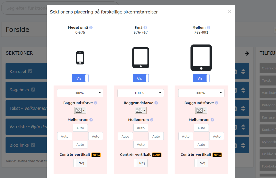
De 6 skærmstørrelser dækker over normale "break points" eller skærmbredder (målt i pixels).
For eksempel kan du lave indstillinger til skærmstørrelsen som vi kalder for "Meget små". Den dækker over alle skærme som er smallere end 576 pixels i bredden.
Den næste skærmstørrelse kalder vi for "Små" og dækker over skærme som er 576 til 767 pixels i bredden. Det er for eksempel en normal smartphone eller en meget lille tablet.
Hvis du laver en ændring under en bestemt skærmstørrelse, for eksempel ved at ændre baggrundsfarven, så vil den ændringen kun være synlig på enheder med lige præcist den skærmstørrelse.
Se eksempel herunder, hvor vi ændrer baggrundsfarven på "mellem" skærme.
På samme måde kan vi ændre andre ting for udvalgte skærmstørrelser. For eksempel kan vi putte ekstra padding (mellemrum) rundt om en sektion, og vi kan også vælge at skjule en sektion helt, hvis man bruger en bestemt skærmstørrelse.
Vis sektioner ved siden af hinanden via bredde-indstillingen
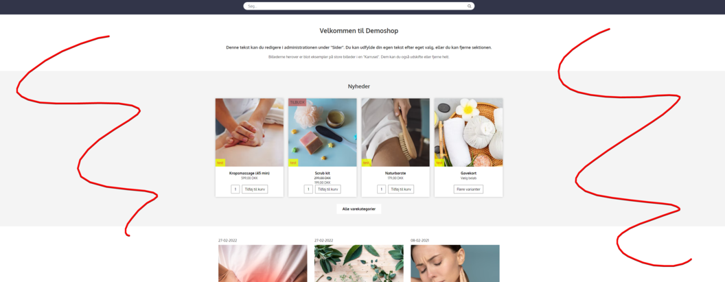
I moderne webdesign er det super vigtigt at forstå og udnytte muligheden for at vise sektioner ved siden af hinanden på store skærme.Fordelen er nemlig, at de samme sektioner kan vises over hinanden på mindre skærme. Og DET er en af de vigtigste muligheder/fordele ved responsivt design.
På den måde kan vi nemlig udnytte skærmpladsen langt bedre. Og samtidig skal vi kun vedligeholde indholdet i sektionerne ét sted.
Vi opnår det ved at ændre en sektions bredde fra standard 100% til noget mindre, for eksempel 50%. Dermed vil sektionen kun fylde halvt så meget som normalt. Og så er der plads til to sektioner ved siden af hinanden.
Når du ændrer på en sektions bredde, så er det vigtigt at sørge for, at de sektioner som ligger i forlængelse af hinanden tilsammen ender med at fylde 100% af skærmbredden.
Du kan eksempelvis vælge at vise 2 sektioner i forlængelse af hinanden, og begge indstilles til at fylde 50% på store skærme. De samme sektioner skal indstilles til at fylde 100% på mindre skærme.
Se eksempel herunder, hvor to sektioner står ved siden af hinanden på større skærme (50% hver), og ovenover hinanden (100% hver) på små og mellemstore skærme.
Forskellen på "100%" og "100% fuld bredde"
Som standard arbejdes der med "breakpoints" indenfor webdesign. Det betyder, at i stedet for at tage højde for alle tænkelige bredder på forskellige skærme, så arbejder vi ud fra 5 breakpoints som er: 576px, 768px, 992px, 1200px og 1400px.Det gør webdesigns mere solide og nemmere at arbejde med.
Det er derfor du ofte ser tomme, hvide områder til højre og venstre på hjemmesider, hvis du benytter en stor PC skærm. Det betyder, at din skærm er større end det nærmeste breakpoint.
Når du indstiller en sektion til at fylde 100% i bredden (som er standard) så betyder det, at sektionen fylder det samme, som den mindste mulighed indenfor breakpoint-spannet.
For "Mellem" skærmstørrelser, som dækker alle bredder mellem 768px og 992px betyder det altså, at sektionen bliver ca. 768px bred.
En skærm som er 900px i bredden vil derfor se sektionen med en bredde på 768px, og dermed opstår der en lille smule tomt område til højre og venstre for sektionen.
Hvis du til gengæld indstiller sektionen til at fylde "100% - fuld bredde" så betyder det, at sektionen vil forsøge at udnytte alt den tilgængelige plads på skærmen. Der kigges ikke på breakpoints. Hvis skærmen er 900px bred, så vil sektionen også være 900px bred.
Det kan være en fordel at bruge "x% - fuld bredde" hvis du har et baggrundsbillede i en sektion.
Summeret:
- Brug altid den normale indstilling "x%" hvis du er i tvivl
- Brug "x% - fuld bredde" hvis du ønsker at bruge hele skærmens bredde
- Hvis du viser sektioner ved siden af hinanden, så skal de have samme indstilling. Altså enten "x%" eller "x% - fuld bredde"
Hvis du ser tomme kasser/områder i dit design
Hvis du ser tomme områder i dit design (sker oftest på større skærme), så skyldes det at dine sektioner ikke passer sammen i bredden.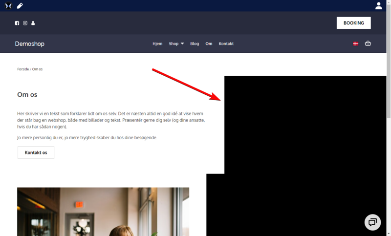
I eksemplet herover, er to sektioner indstillet til at fylde hhv. 50% og 55% på den samme skærmstørrelse.
Da der ikke kan vises 105% i bredden, bliver hver sektion vist på sin egen linje. Og resten af linjen er derfor tom.
For at fikse dette skal du sikre, at dine sektioner har de rette bredde-indstillinger.
Hvis én af dine sektioner er indstillet til at fylde 50% i bredden, så skal der være en eller flere sektioner før/efter denne, som udfylder de resterende 50% af bredden.